Maximizing In-Store Marketing: A Look at the Perfect Product Display
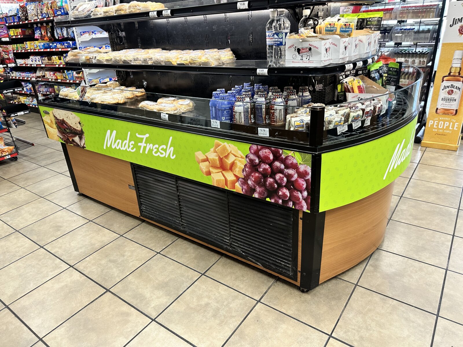
In today’s competitive retail environment, every inch of store space needs to work hard, especially when it comes to in-store displays. A well-designed display isn’t just about holding products—it’s about attracting customers, encouraging purchases, and reinforcing brand messaging. Let’s take a closer look at this example of a display that gets it right.
1. Visual Appeal and Clean Branding
One of the first things that stand out about this display is its visual design. The vibrant green banner with the “Made Fresh” messaging immediately captures attention. The crisp imagery of fresh ingredients, such as grapes and cheese, gives off a healthy, appetizing vibe that aligns perfectly with the products on display. The bright colors contrast beautifully against the darker background of the refrigerated unit, making the whole setup pop.
2. Strategic Product Placement
The display is strategically positioned at the center of a busy aisle, ensuring high visibility from multiple directions. The shelving is arranged to give clear access to popular grab-and-go items such as sandwiches, drinks, and snacks. Notice how the products are neatly organized, making it easy for customers to quickly spot what they need without feeling overwhelmed. This balance between product variety and simplicity is key to minimizing decision fatigue and maximizing sales.
3. Customer-Centric Convenience
A significant part of the display’s success is how it caters to customer needs. Whether a shopper is grabbing a quick snack or stocking up for a road trip, everything is within easy reach. The selection is diverse but well-curated, offering something for everyone. By providing high-demand products in a central location, the display meets the fast-paced shopping habits of today’s consumers.
4. Reinforcing the Freshness Message
The “Made Fresh” slogan is more than just words; it’s reinforced by the products and visuals. The imagery of fresh ingredients is directly aligned with what’s being sold in the display—fresh sandwiches, baked goods, and more. This consistency between messaging and products builds trust, encouraging shoppers to feel confident in the quality and freshness of their purchase.
5. Enhanced Brand Recognition
This display doesn’t just sell products; it tells a brand story. The large, consistent branding across the display creates a cohesive look that strengthens brand recognition. Whether a customer is a regular or a first-time visitor, this strong branding helps them remember what the store stands for—convenience, freshness, and quality.
Conclusion
This display is a prime example of how a well-thought-out design can enhance the in-store shopping experience. From its eye-catching visuals to its customer-friendly layout, every element works together to drive engagement and increase sales. For any business looking to boost their in-store marketing efforts, this display is a blueprint worth emulating.
By focusing on aesthetics, convenience, and consistency, retailers can create displays that not only attract customers but also build brand loyalty and boost revenue.
